
Data visualization
Data visualization: the key to effective data analysis in the modern business world
Data visualization has established itself as a central tool in today's data-driven business world. It focuses on transforming complex data sets into visual representations, making it much easier to interpret and understand data. This technology is essential for companies to gain meaningful insights from large amounts of data and make informed decisions.
The basis for effective data visualization is the collection and preparation of data. By using modern analysis tools and software, data from various sources is brought together and visualized in the form of graphs, charts and maps. These visual representations make it possible to quickly recognize patterns, trends and correlations and to communicate complex information in an easily understandable way. This approach not only improves data analysis, but also increases the efficiency of decision-making.
Another important aspect of data visualization is its role in business intelligence (BI) and reporting. By visualizing business data, companies can monitor key performance indicators (KPIs) more effectively and make strategic decisions based on a solid data foundation. Visualizing data also supports predictive analytics by helping to forecast future trends and patterns.
Data visualization makes it possible to consolidate data from different systems, such as customer relationship management (CRM) and enterprise resource planning (ERP), and present it in a comprehensive context. The benefits are manifold: from improving internal communication and collaboration to optimizing customer interactions through data-driven insights.
The doubleSlash blog offers in-depth insights and practical use cases for anyone who wants to learn more about data visualization.

Road to Dashboards: Datenintegration
13.03.2024 –
Wie entstehen Dashboards und welche Bausteine sind dafür unerlässlich?
read more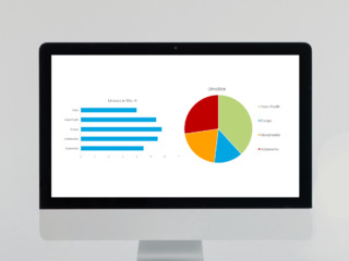
Dos & Don’ts der Datenvisualisierung
14.02.2024 –
In einer Welt, die von Daten überflutet wird, ist die Kunst der Datenvisualisierung entscheidender denn je. Richtig eingesetzt, kann sie komplexe Informationen zugänglich und verständlich machen. Doch nicht jede Visualisierung erreicht ihr Ziel – manche klären auf, andere verwirren.
read more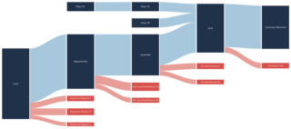
Visualisierung von Datenflüssen
17.01.2024 –
Die Darstellung von Datenflüssen bringt Klarheit und Tiefe in die Welt der Datenvisualisierung.
read more
Visualization of AI survey results: Opinions and trends at a glance
13.10.2023 –
Surveys are an indispensable method for collecting feedback and opinions from a target group. However, they often generate an overwhelming amount of data. How can we gain valuable insights from this flood of data and make data-based decisions?
read more
Data visualization in Confluence: Your guide to appealing diagrams
06.09.2023 –
In our data-driven world, appealing and clear visualizations are more important than ever to make complex information easy to understand. With Confluence, you have numerous options for presenting your data in an impressive way.
read more