
UX/UI design 2015 and where is the journey heading?
 A lot has happened in the field of devices in the last two years. Resolutions have increased, as have bandwidths. Cell phone displays have become larger and larger, and so-called phablets are conquering the market.
Various design approaches and the resulting design patterns have developed rapidly over the past two years. This is certainly also due to the rapid development of mobile devices and the change in their use.
Let's take a brief look at the developments in UX/UI design and then take a look into the future.
Mobile first
In 2014, the web design approach was still "mobile first". This approach suggests taking advantage of the avoidable weakness of a lack of space on small screens, for example, and finding a reduced design solution for all screen sizes by dispensing with less important information and control elements. The aim is to provide the user with a clear and visually appealing interface.
Mobile only
This year, one can dare to speak of the term "mobile only", as it is increasingly important to provide a strong mobile presence to reach the user. This is underlined by Google's decision to give higher priority in search to pages that are properly optimized for mobile browsing. The update was martially named "Mobilegeddon" and was announced in April 2015[1].
Phablets
This trend and the increasing prevalence of phablets will pose new challenges for UX/UI designers, developers and budgets, as the line between the smartphone as an on-the-go device and the tablet as a leisure device for home use becomes blurred. In future, several use cases for the new screen size will have to be taken into account. It must also be ensured that an optimal user experience is created for all devices, without disregarding how phablets are currently still being used.
Flat design
A change has also taken place in the area of UI design. Since 2013, so-called "flat design" has been all the rage. Flat design is the term for web design without textured graphics, 3D CSS3 hacks, glossy effects or shadows. Flat design simply omits everything and works with clear boundaries in terms of color, areas, font and font size.
Material Design
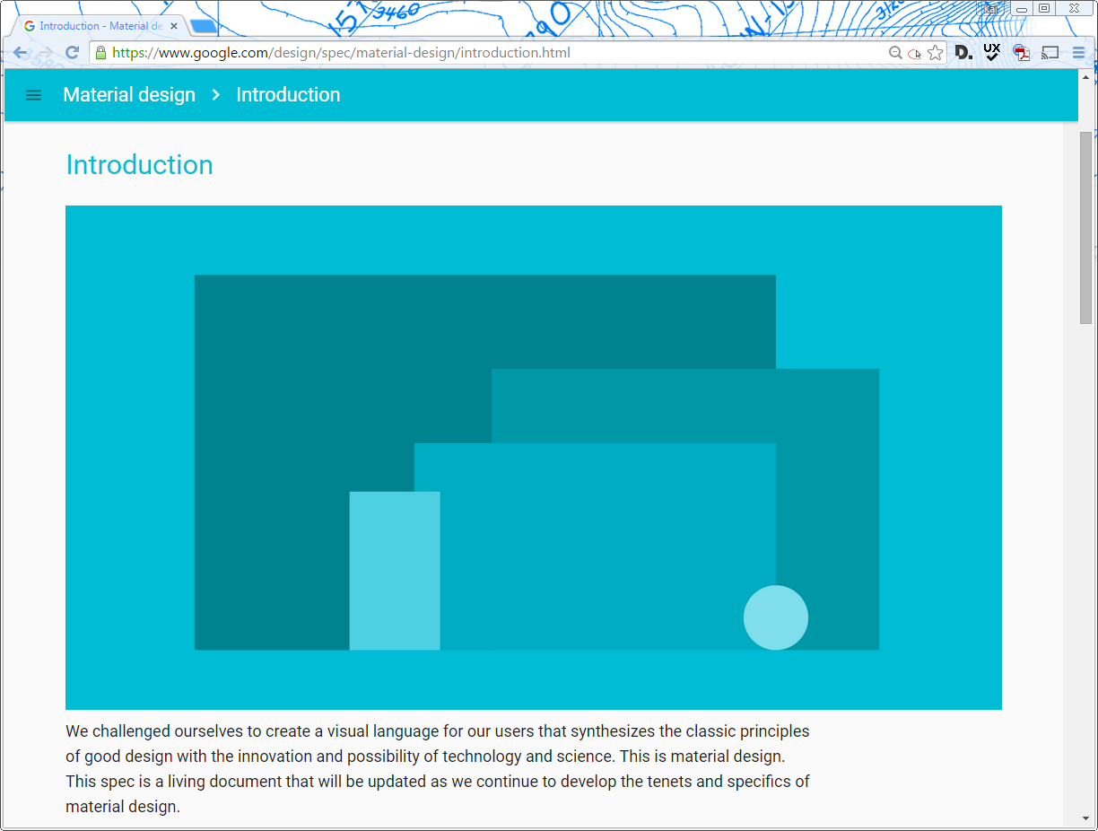
This trend was replaced by Google's "Material Design", sometimes also referred to as "Flatty Design". Google offers regulations and instructions for all form factors such as laptops, tablets, smartphones, televisions and the increasingly widespread smartwatches.
At first glance, the design looks very similar to the flat design. This is because this design also relies heavily on icons and fonts as the main design elements. In addition, large, monochrome elements with high-contrast and very bright colors are used.
However, the most important difference to the flat design is the fact that the elements also have a Z-coordinate, i.e. a three-dimensional factor. This allows Google to overlay and animate the elements independently of each other and calculate their shadows. This gives the user a clear idea of the hierarchy and provides valuable assistance when using the application.
A good example of user guidance is the so-called "highlighted floating action button", which clearly signals to the user where to click for the next step.
Meaning with motion
This help for the user is also supported by gentle animations ("Meaning with motion"), which indicate which action has been carried out. In Google's specification, this is also called "Meaningful Transition" [2]. As a result, the user learns intuitively when using the application and does not have to go through a learning program. The selected action is gently transferred to the new state and not simply loaded as before.
Cards
The so-called card layout is becoming increasingly popular. Cards are used to group information in a very intuitive way and enable the user to quickly skim the content of a page and capture the part that is relevant to them. By selecting a card, the information required by the user is highlighted and brought into focus. This type of presentation is not suitable for all content, but can lead to a good user experience if used sensibly. A very good example of a teaser card app is Pinterest.
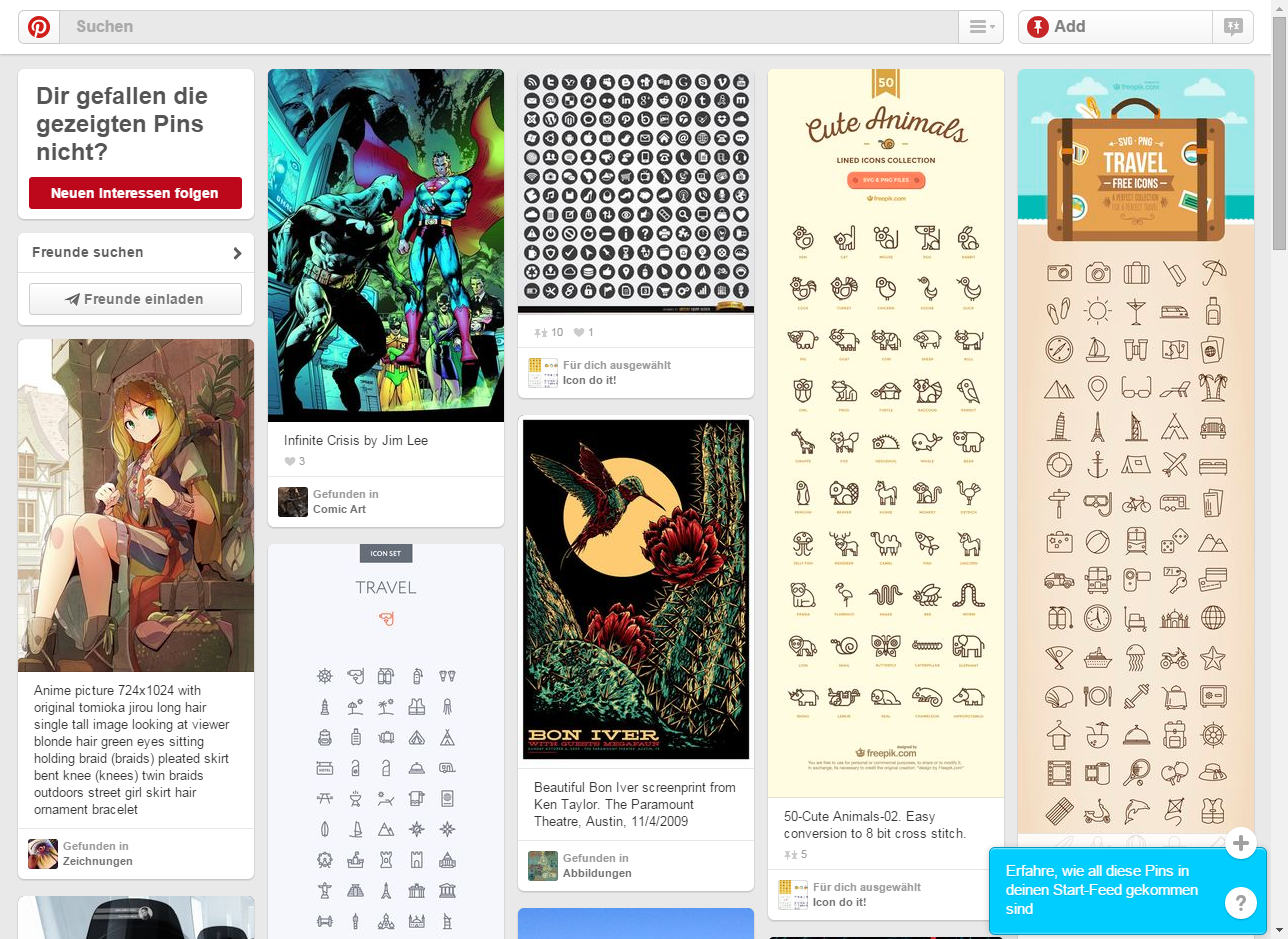
Pinterest even dispenses with navigation altogether and the user only navigates by swiping, scrolling and selecting.
You can see that developments are increasingly geared towards the optimized use of an offer on mobile devices. The user and their experience with the content is becoming more and more important. They should be able to interact with the content as easily as possible and on as many devices as possible.
It is exciting to see what technology will make possible in the coming years.
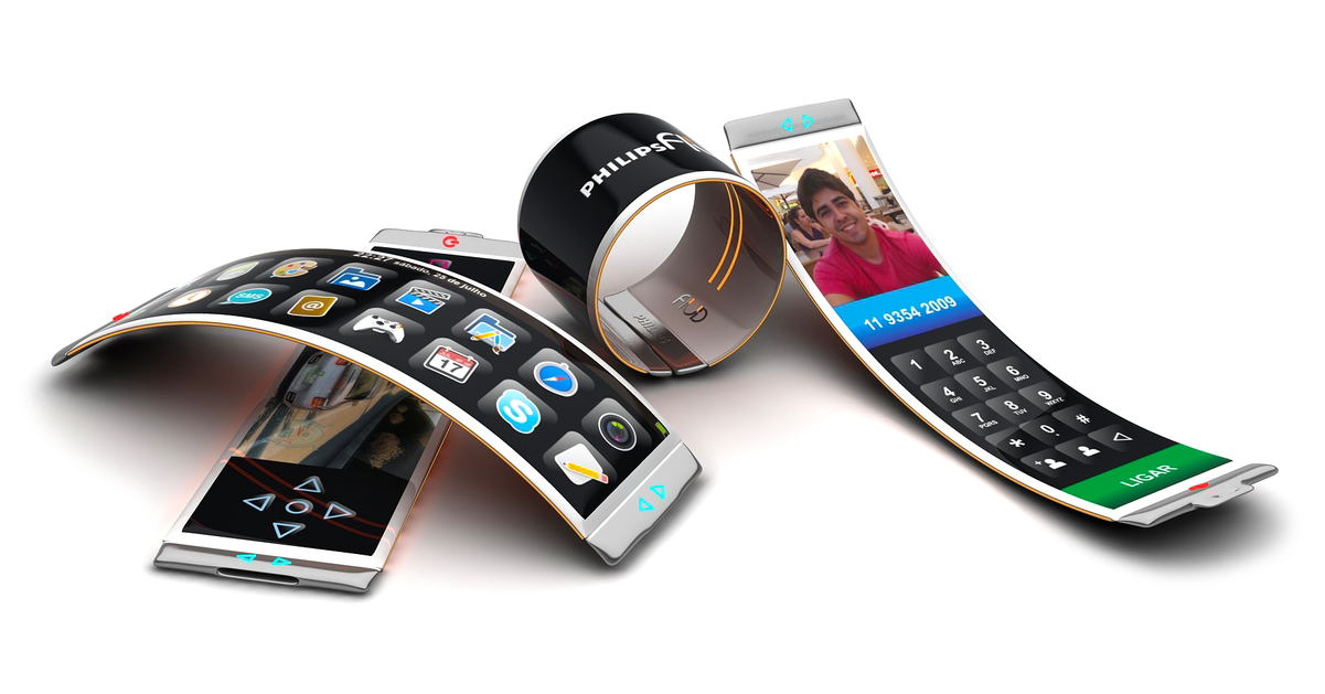
Flexible phones as wristbands
Smartwatches have been enhancing the functions of smartphones and tablets for some time now. Fitness enthusiasts in particular now wear small wristbands that contain a lot of technology. In the future, phones will also be able to fit around the wrist as a bracelet. The idea is to manipulate the shape of the wristband so that it can either be worn on the wrist or used as a normal phone. With an integrated SIM card, there are no more dependencies on mobile devices.
The main challenges to be solved will be usability, size and wearing comfort if these products are to be successful.
Invisible devices
In the near future, they will be discreetly integrated on or in our bodies. Examples include MIT's contraceptive chip [3] and Google's contact lenses [4].
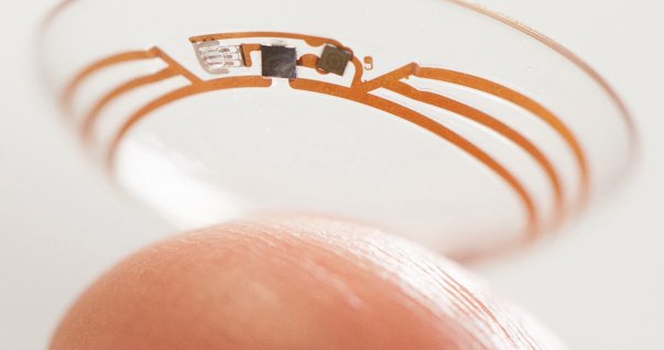
These invisible devices can be used in medicine or the fitness sector. But great opportunities are also seen in other areas such as security or payment systems.
They will become a key element in making the user experience as seamless and unobtrusive as possible. Technology will simply become an integral part of ourselves and our daily lives.
Self-driving vehicles
They are already being tested in various parts of the world and will certainly become part of our daily lives in the near future.
Connecting the vehicle to our mobile devices creates a variety of UX/UI design possibilities for both the devices and the cockpit of our vehicle or its windshield. Call your vehicle to pick you up or customize the mood in the vehicle by setting the interior lighting or music to your liking.
Summary
The above is just a very brief outline of what I consider to be the most important developments in the field of UX/UI design. Each individual headline fills entire sections in trade journals and blog posts. However, I find the development very exciting and see that one thing is increasingly coming to the fore in all of them: the user and their interaction with the user interface. The biggest challenge will be to develop dynamic layouts that feel and operate the same across all devices so that users can be optimally supported in their everyday tasks.
I am looking forward to the coming years and am very curious to see how design will develop for all these fascinating possibilities. In particular, what new operating concepts will arise for us UX/UI designers as a result of wearable or invisible devices.
Sources:
[1] https://www.tagesschau.de/wirtschaft/google-mobile-seiten-101.html
[2] https://www.google.com/design/spec/animation/meaningful-transitions.html
[3] http://www.spiegel.de/wissenschaft/mensch/verhuetung-mikrochip-soll-16-jahre-vor-schwangerschaft-schuetzen-a-982270.html
[4] http://www.spiegel.de/netzwelt/gadgets/intelligente-kontaktlinse-google-und-novartis-arbeiten-zusammen-a-981187.html